Winter · Hathaura Color Standard v1.0
Bright Winter (Clear Winter) Color Palette & Celebrities
Bright Winter is a vivid, cool-leaning season with very high contrast and clear coloring. It is defined first by brightness, then by coolness: its best colors are saturated jewel tones and icy brights, never muted or earthy.
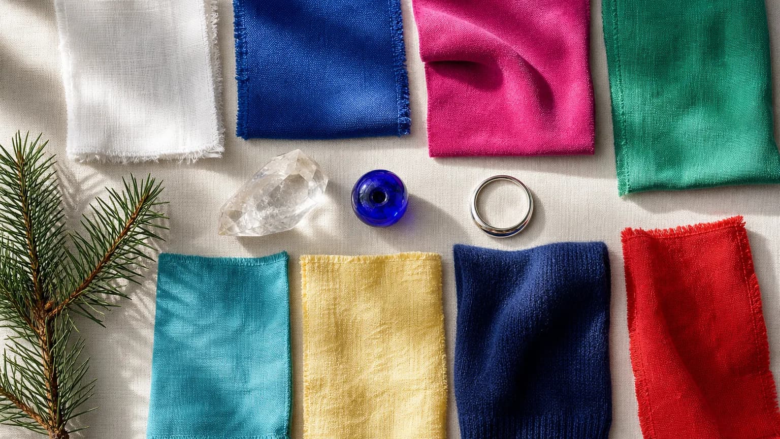

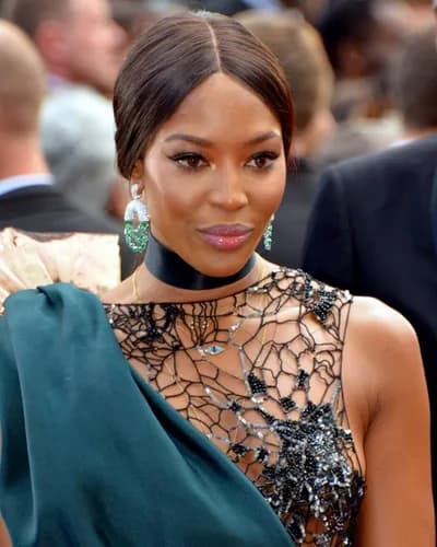


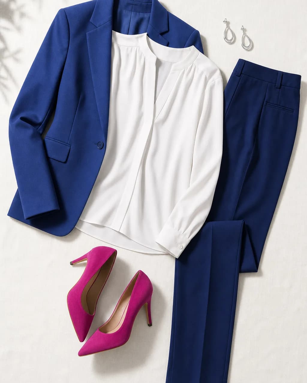
Moodboard and outfit are AI-generated illustrations. Celebrity photos are credited in the celebrities section.
If dusty, earthy colors make you look tired and flat, beige and camel seem to erase you, and a cobalt shirt or a hot-pink sweater makes people tell you your eyes are glowing, you may be a Bright Winter. This guide covers how to recognize the season, the exact colors that flatter it (with hex codes you can shop with), what to avoid and why, how to build outfits and a capsule wardrobe, makeup and hair direction, and how to tell Bright Winter apart from its closest neighbors.
By the Hathaura Color Studio editorial team · Last reviewed October 20, 2026
Download the Bright Winter palette for your phone
All 27 core colors with names and hex codes, sized for your phone's photos so you can shop with it.
The complete guide
Bright Winter Style Guide
All 47 colors, every pairing, makeup product picks, prints, metals and stones, and wardrobe basics, in a printable PDF you keep. 800+ guides sold, rated 4.8★ on Etsy.
Download FULL Guide on EtsyFor stylists & color analystsSend your clients a beautiful Bright Winter report with your own logo.
Make your first one freeBright Winter at a glance
| Undertone | Neutral-Cool |
|---|---|
| Value | Medium |
| Chroma | Bright (clear) |
| Contrast | High |
| Defined by | bright chroma (clarity), then cool undertone (hue) |
| Sister seasons | Cool Winter, Bright Spring |
| Best neutrals | Light Yellow, Mint, Lavender |
| Best metal | Polished silver |
| Single best color | Royal Blue #3860B8 |
| Single worst color | Warm Autumn Mustard #C89830 |
- Undertone
- Neutral-Cool (2 of 5)
- Value
- Medium (3 of 5)
- Chroma
- Bright (clear) (5 of 5)
- Contrast
- High (5 of 5)
Bright Winter by the numbers
- 16 of 309 Hathaura guide orders in 2025 were for Bright Winter (5.2%).
- When people retook a selfie analysis on ColorSnap AI (our own free tool), the season changed 62.2% of the time. Lighting matters, especially for muted seasons.
Source: Hathaura Etsy sales and ColorSnap AI analyses.
Where Bright Winter sits among the 12 seasons
How to recognize a Bright Winter
Skin
Skin is neutral-cool and clear: porcelain, cool ivory, rosy beige, neutral olive or cool brown to deep brown, often with a smooth, almost translucent quality that looks lit from within when the colors are right. The undertone leans cool but is not icy, so a little warmth can sometimes be carried, while golden and earthy colors make skin look sallow. Bright Winter exists across every skin depth, from very fair to deep.
Eyes
Eyes are the giveaway: clear, bright and vivid, with crisp whites and a sharp ring around the iris. Common colors are icy or bright blue, clear green, bright hazel with flecks of green or blue, cool grey and very dark brown that looks almost black. Whatever the color, the eyes sparkle rather than blend.
Hair
Natural hair is usually medium-dark to very dark: dark brown, black-brown or black, often with a cool or neutral cast and a natural shine. A smaller group has lighter, clear hair with very bright eyes. Hair alone is an unreliable clue, because dye, sun and age change it more than skin or eyes.
Signs you're a Bright Winter
- Your features are clear and defined. People notice your eyes first, and the whites of your eyes and teeth look bright against your skin.
- Muted, dusty colors (beige, khaki, sage, dusty rose) make you look tired, grey or "blah", even when they are in fashion.
- Saturated colors (cobalt, emerald, fuchsia, true red) look vivid on you without overpowering you. Your face still reads first.
- Pure white and icy white look fresh and clean on you, while cream and ivory can look dingy or yellow by comparison.
- Silver, white gold and platinum look natural. Yellow gold can work in small, polished pieces, but brushed or antique gold looks flat.
- You get compliments in clear, high-energy colors and in high-contrast outfits: navy with white, black with a bright accent.
Signs you're probably not a Bright Winter
- Your features blend into each other and nothing stands out first. That points toward a soft season, not Bright Winter.
- Golden yellow, coral and warm orange-red look healthier on you than blue-based pinks and cool blues. That points toward Bright Spring or Warm Spring.
- Very dark, deep colors (inky navy, burgundy, deep forest) look richer on you than bright, medium-value ones. That points toward Dark Winter.
- Soft pastels and powdery colors look better on you than vivid ones. That points toward a Summer season.
The most common mistype
The most common mistype is Bright Spring. Both seasons are defined first by brightness, so both look wonderful in clear, saturated color and both are washed out by muted tones. The difference is the undertone: Bright Winter leans cool (blue-based pinks, cobalt, icy white, silver); Bright Spring leans warm (coral, warm hot pink, cream, gold). The second most common mistype is Dark Winter, especially for Bright Winters with very dark hair: Dark Winter is defined by depth and looks best in deep, slightly heavier colors, while a Bright Winter needs the clarity of medium-value brights and can look heavy in a wardrobe of very dark tones.
Bright Winter contrast level
Contrast is the difference in depth between your skin, hair and eyes. Bright Winters are typically high, often the highest of any season: dark hair against light or clear skin, or vivid eyes that stand out sharply from the face. That is why tone-on-tone muted outfits look flat on a Bright Winter, while navy with icy white, or a jewel tone against a dark neutral, looks polished and natural.
Lighting and camera caveats
62%
of selfie retakes on ColorSnap AI landed on a different season
1 in 15
stylist re-analyses on the Hathaura platform changed season (small sample)
Lighting changes everything. Warm indoor bulbs add yellow to every color and every skin tone, which can push a Bright Winter toward Bright Spring in a selfie, and dim or filtered light dulls clear coloring until it reads as Dark Winter or even a soft season. When people retook selfie analyses on ColorSnap AI (our own free tool), their season changed 62% of the time (56 of 90 retakes). When stylists re-analyzed a client on the Hathaura platform with a new photo, the season changed once in 15 re-analyses, a small sample but a very different picture. For a reliable read, test colors in indirect daylight near a window, with no makeup, no filters and hair pulled back, and compare two colors at a time. Compare color analysis apps.
Bright Winter drape tests
Hold each pair of colors under your chin in daylight, one at a time, and watch your skin, not the fabric.
| Test | Bright Winter color | Compare with | What to look for |
|---|---|---|---|
| Brightness test | Fuchsia #C83888 | Soft Summer Mauve #A85A6A | In the clear fuchsia, skin looks smooth and the eyes sparkle. In the dusty mauve, the face can look grey, tired or shadowed. |
| Coolness test | Hot Pink #D84888 | Bright Spring Hot Pink #F87898 | Both are bright. The blue-based pink should make skin look clear and even; if the warm coral-pink looks fresher and the blue-pink looks harsh, consider Bright Spring. |
| White test | Icy White #F8F4F8 | Soft Autumn Cream #E8DED0 | Icy white should look crisp and make the eyes and teeth look brighter. Cream tends to look dingy or yellow next to clear coloring. |
| Dark neutral test | Deep Navy #1C3880 | Soft Autumn Chocolate #6C5040 | Deep navy should frame the face cleanly. Brown tends to look muddy and can make skin look sallow on a Bright Winter. |
| Red test | True Red #E83838 | Warm Autumn Rust #A83828 | The clear red should look vivid but balanced, with the face still leading. The earthy rust tends to dull the skin and make the eyes look flat. |
| Clarity test | Emerald #38A868 | Dark Winter Hunter Green #205838 | A Bright Winter usually looks more awake in the clear emerald. If the deep hunter green looks richer and the emerald looks loud, consider Dark Winter. |
Bright Winter color palette: the best colors
Bright Winter colors are clear first and cool second. Think of a winter carnival at night: electric blue and cobalt, emerald and jade, hot pink and fuchsia, true red, royal purple and turquoise, all lit against fresh snow. Every color is clean, with no grey, brown or dust mixed in, which is what lets it match the clarity of your coloring.
The palette is built on medium values with very light and very dark extremes. Saturated medium brights are your workhorses; icy white and the icy lights (mint, light yellow, light pink, lavender) sit at one end, and deep navy, navy purple and dark forest at the other. Because your contrast is high, combining a light and a dark, or a dark and a bright, almost always works.
Use the measured ranges as a shopping check: Bright Winter colors sit at the high end of the chroma scale (clear and saturated), with hues concentrated in cool blues, blue-greens, blue-based pinks and purples, plus a few clear yellows and reds. A color that looks "dusty", "earthy", "faded" or "golden" is almost always outside the range.
Tap any color to see it large, copy its hex code and see what it pairs with.
Pastels
Blues & Greens
Pinks & Purples
Neutrals
Measured range of the Bright Winter palette (10th–90th percentile, CIELAB/LCh): lightness L* 33–85, chroma C* 18–63, hue 151° through 0° to 13°.
| Color | Hex | Role |
|---|---|---|
| Icy White | Accent | |
| Light Yellow | Accent | |
| Mint | Accent | |
| Light Pink | Accent | |
| Lavender | Accent | |
| Periwinkle | Basic | |
| Royal Blue | Basic | |
| Navy Blue | Accent | |
| Deep Navy | Accent | |
| Turquoise | Accent | |
| Teal Green | Basic | |
| Emerald | Basic | |
| Forest Green | Basic | |
| Jade | Basic | |
| Chartreuse | Accent | |
| Dark Forest | Accent | |
| Hot Pink | Basic | |
| Fuchsia | Basic | |
| Orchid | Basic | |
| Purple | Basic | |
| True Red | Basic | |
| Deep Red | Basic | |
| Royal Purple | Basic | |
| Navy Purple | Accent | |
| Light Yellow | Neutral | |
| Mint | Neutral | |
| Lavender | Neutral |
This is the 27-color core palette. The complete Bright Winter Style Guide has all 47 colors, organized by group, ready to print. Get the complete guide →
Colors to avoid for Bright Winter
- Anything muted, dusty or muddy (beige, khaki, sage, dusty rose, mauve) dulls clear coloring and makes skin look grey or tired.
- Warm, earthy tones (camel, warm browns, mustard, rust, orange-based reds) clash with the cool-leaning undertone and can make skin look sallow.
- Soft, powdery pastels lack the clarity your coloring needs. Choose icy lights, which are pale but clear, instead.
- Low contrast overall. Tone-on-tone outfits in mid-value, softened colors look flat on a high-contrast face.
Swap this for that
Warm Autumn Mustard #C89830 → Light Yellow #F8E888
Too golden and muted; it makes clear skin look sallow.
Olive Green #6C9068 → Emerald #38A868
Too dusty and warm; it drains the sparkle from your eyes.
Dusty Pink #C89890 → Hot Pink #D84888
Too muted; the face looks grey and tired next to it.
Soft Autumn Chocolate #6C5040 → Deep Navy #1C3880
Too warm and muddy for cool, clear coloring.
Warm Autumn Rust #A83828 → True Red #E83838
Too earthy; it dulls the skin and flattens contrast.
Warm Autumn Camel #C0A068 → Navy Blue #2C4898
Too warm and too close to the skin; it erases definition.
Best neutrals for Bright Winter
Your neutrals are high-contrast and clean: icy white and pure white, light cool grey, charcoal, black, deep navy, navy purple and dark forest green.
Swap camel and beige for navy or light cool grey. Swap cream for icy white. Swap brown for deep navy, charcoal or black.
Black and white are wearable, but on their own they can look severe. Add one clear bright (a cobalt scarf, a fuchsia lip, an emerald top) to every black, white or black-and-white outfit.
Bright Winter outfits, clothing and color combinations
The best Bright Winter combinations repeat the high contrast and clarity of your coloring. Pair a light with a dark (icy white with deep navy), or a dark neutral with a vivid accent (navy with fuchsia). Analogous outfits work when both colors are clear, such as fuchsia with royal purple. Balanced contrast, two clear colors from opposite sides of the color wheel such as emerald with hot pink, is where this season shines.
Use proportions to keep strong color polished: about 60% main color (usually a crisp neutral), 30% secondary color, and 10% accent, worn near the face or as a single accessory. Color blocking in two or three saturated colors is also a natural fit.
Tonal
Deep Navy #1C3880 + Royal Blue #3860B8 + Sky Blue #88C8E8
Analogous
Fuchsia #C83888 + Royal Purple #5838A0
Balanced contrast
Emerald #38A868 + Hot Pink #D84888
These are sample combinations. The complete guide has every Tonal, Analogous and Balanced Contrast pairing for Bright Winter. Get the complete guide →
Outfit formulas (60 / 30 / 10)
Navy and brights
60% Deep Navy #1C3880 · 30% Icy White #F8F4F8 · 10% Fuchsia #C83888
Jewel greens
60% Dark Forest #2C5830 · 30% Jade #3CA088 · 10% Hot Pink #D84888
Icy and electric
60% Icy White #F8F4F8 · 30% Royal Blue #3860B8 · 10% Light Yellow #F8E888
Berry and purple
60% Navy Purple #2C3870 · 30% Orchid #B84898 · 10% Turquoise #50C0D8
What to wear: Bright Winter outfit ideas
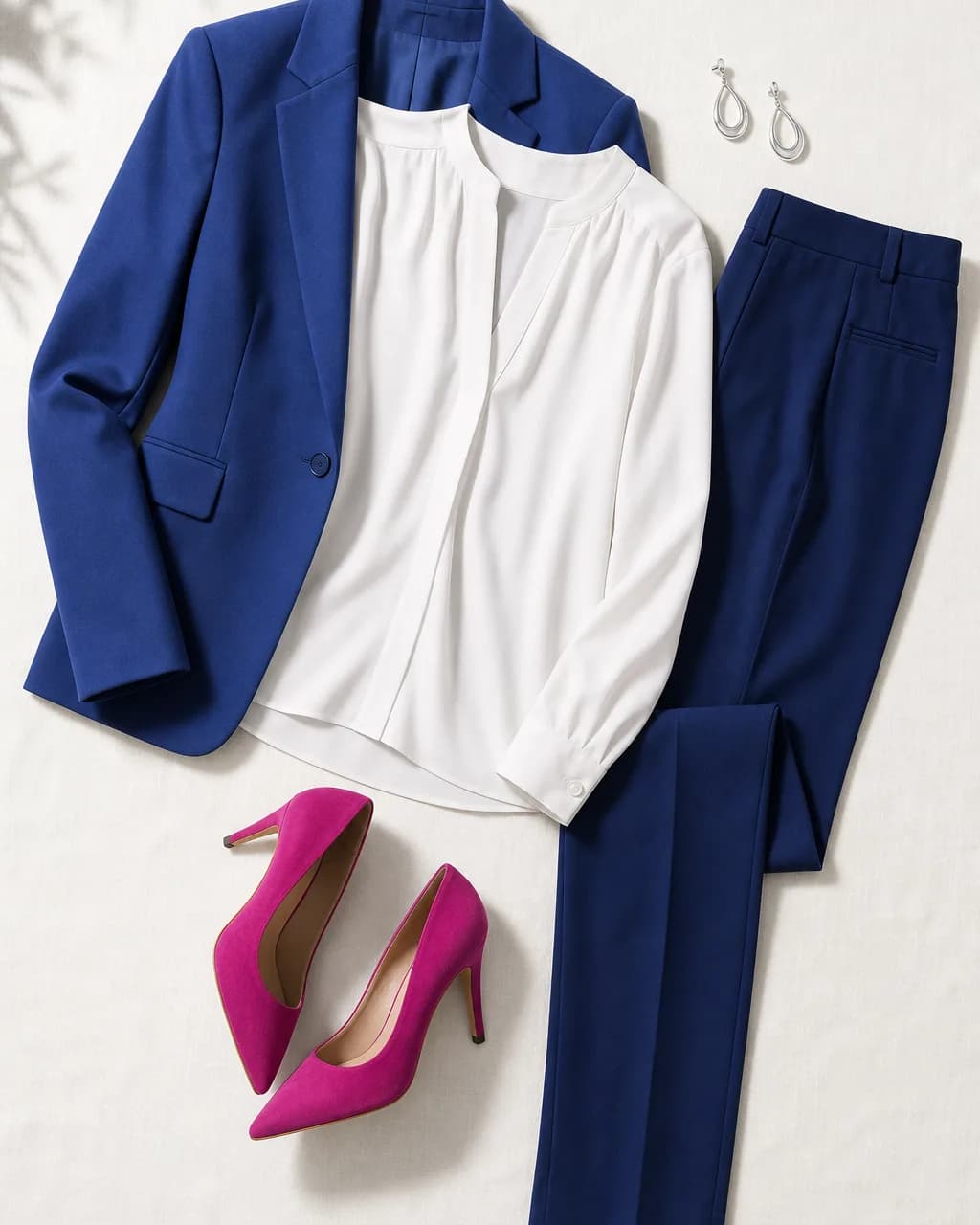
Work
Navy and icy white
- Blazer: Navy Blue #2C4898
- Blouse: Icy White #F8F4F8
- Trousers: Deep Navy #1C3880
- Pumps: Fuchsia #C83888
Polished silver earrings. A crisp light-dark base with one bright accent keeps the look sharp but professional.
Evening
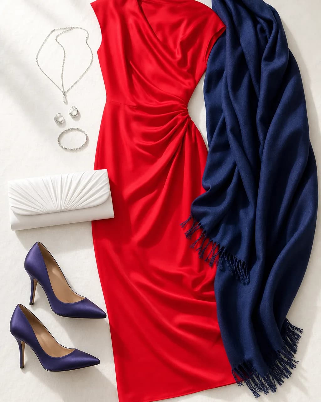
True red
- Dress: True Red #E83838
- Wrap: Deep Navy #1C3880
- Heels: Navy Purple #2C3870
- Clutch: Icy White #F8F4F8
Satin, crepe or a fine sheen fabric; silver or platinum jewelry and a matching red lip.
Everyday
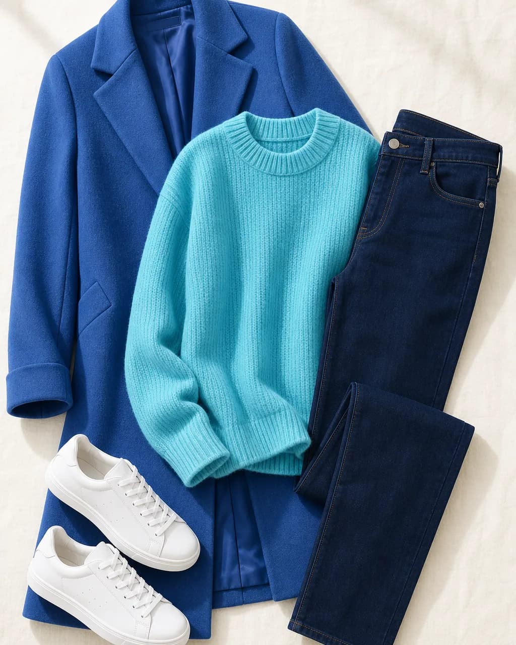
Turquoise and indigo
- Knit sweater: Turquoise #50C0D8
- Jeans (dark indigo): Deep Navy #1C3880
- Coat: Royal Blue #3860B8
- Sneakers: Icy White #F8F4F8
Dark, clean-wash denim reads crisper than faded or distressed blue.
Weekend
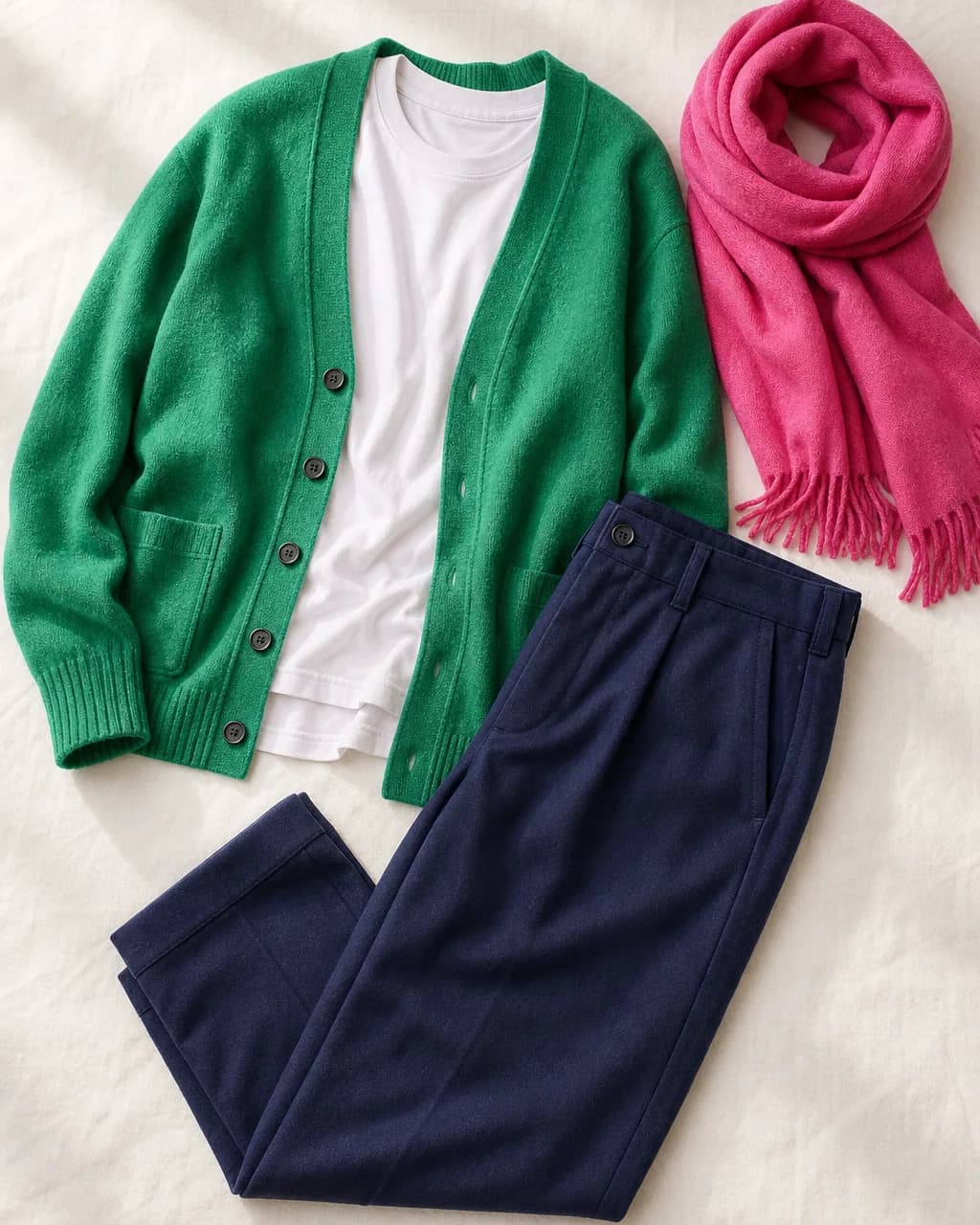
Emerald and pink
- T-shirt: Icy White #F8F4F8
- Cardigan: Emerald #38A868
- Trousers: Navy Purple #2C3870
- Scarf: Hot Pink #D84888
Balanced contrast: two clear colors from opposite sides of the color wheel, anchored by a dark neutral.
Men's
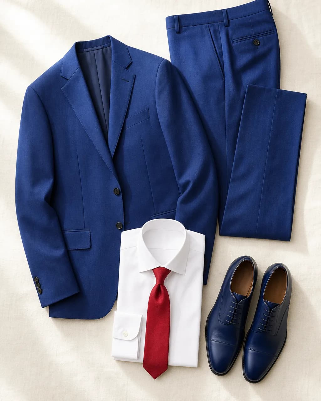
Navy and white
- Suit: Navy Blue #2C4898
- Shirt: Icy White #F8F4F8
- Tie: Deep Red #C82838
- Shoes: Deep Navy #1C3880
A crisp white shirt and a clear red or cobalt tie suit a Bright Winter man. A black suit works too, as long as there is a bright tie or pocket square.
Bright Winter capsule wardrobe
A 20-piece Bright Winter capsule built on the 60/30/10 rule: mostly crisp neutrals, a layer of clear secondary colors, and a few vivid accents. Every piece works with almost every other piece, and black, charcoal or pure white pieces you already own fit straight in.
Neutral foundation (about 60%)
Wool coatDeep Navy
Trench coatNavy Blue
BlazerDeep Navy
Tailored trousersNavy Purple
Wide-leg trousersIcy White
Jeans (dark indigo)Deep Navy
Knit sweaterIcy White
Fine-knit turtleneckNavy Purple
T-shirtIcy White
T-shirtSky Blue
Midi skirtDark Forest
CardiganNavy Blue
Secondary colors (about 30%)
BlouseRoyal Blue
ShirtTurquoise
SweaterEmerald
DressFuchsia
Knit topRoyal Purple
Accents (about 10%)
ScarfHot Pink
Silk topLight Yellow
BagTrue Red
Prints, fabrics, metals and jewelry for Bright Winter
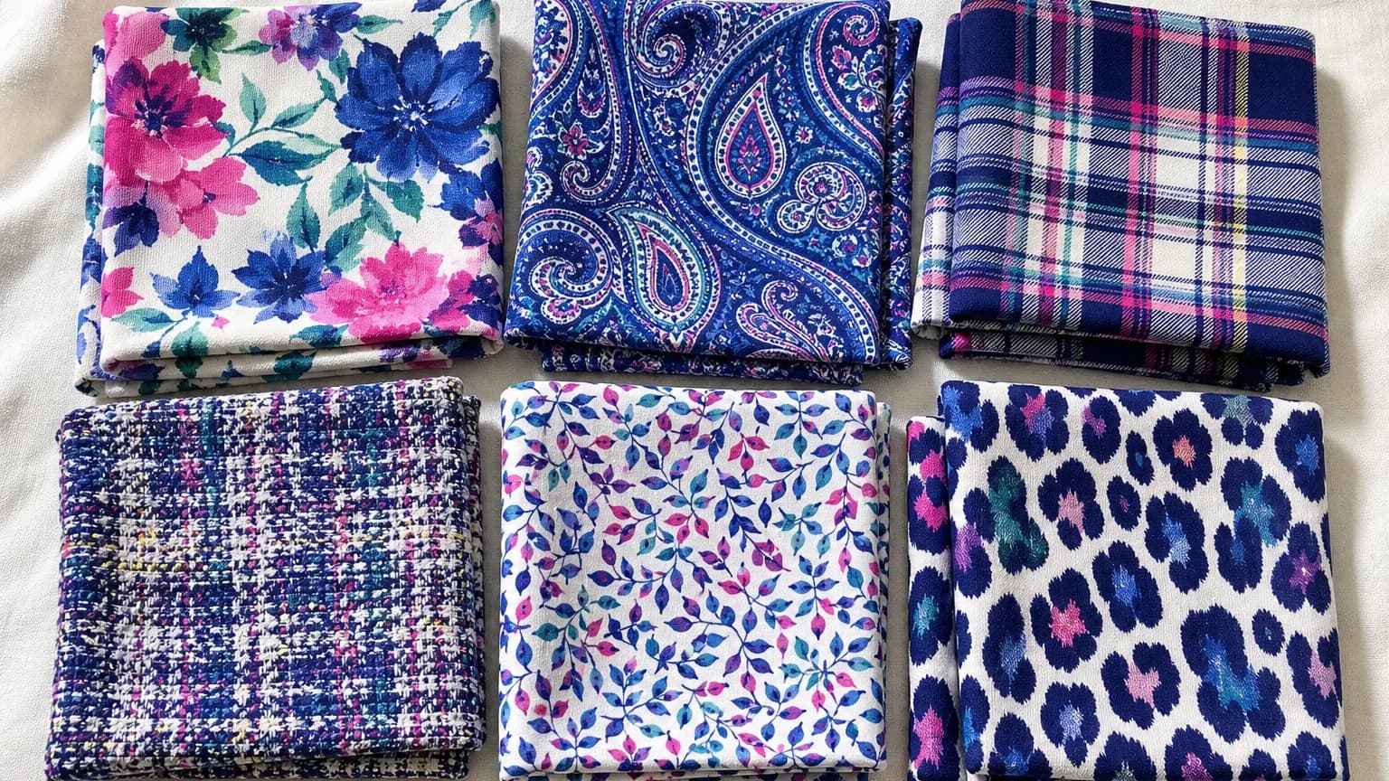
Prints and patterns
- Choose bold, crisp prints with high internal contrast: geometrics, graphic stripes, polka dots, houndstooth, color blocking and large-scale florals in clear colors.
- Keep at least 50–70% of a print's colors inside your palette, and look for clean edges rather than blurred, watercolor or faded effects.
- Large-scale prints look most natural. Small, busy or low-contrast prints look fussy and dull next to clear coloring. Remember that prints add visual volume, so place them where you want attention.
- Animal prints work in their graphic versions (black-and-white zebra, cool-toned or brightly colored leopard) rather than golden or brown.
Fabrics and finishes
- Smooth, crisp and lightly lustrous textures echo Bright Winter coloring: crisp cotton poplin, silk, satin, fine wool, sharp gabardine, leather and fine knits.
- Heavy, nubby or very matte rustic textures (chunky tweed, washed linen, suede in earthy colors) absorb light and dull the clarity your coloring has.
- Sheen is a friend. Satin, patent accents and a fine metallic thread work well for evening, as long as the color itself stays clear and cool.
Best metals for Bright Winter
Because the undertone leans cool, silver, white gold and platinum are the natural match, and their crispness echoes your high contrast. Polished finishes usually look better than brushed or oxidized ones on a Bright Winter. Yellow gold can work in small, shiny pieces; muted, antiqued and coppery metals look dull.
Best
Polished silver, White gold, Platinum
Also good
Bright, polished yellow gold in small pieces, Rhodium-plated, Gunmetal
Use with care
Brushed or antique gold, Copper, Bronze
Stones: Sapphire, Ruby, Emerald, Amethyst, Clear diamond or crystal, Blue topaz, Pink tourmaline, Bright white pearls.
- Glasses frames: black, clear crystal, deep navy, cobalt, jewel-toned acetate or polished silver metal. Avoid warm tortoiseshell, honey and brushed gold.
- Nails: true red, fuchsia, hot pink, cobalt, emerald, deep berry or a sheer cool pink; glossy finishes.
- Bags and shoes: black, navy, charcoal, crisp white and jewel-toned leather rather than tan, cognac or brown.
Bright Winter makeup and hair colors
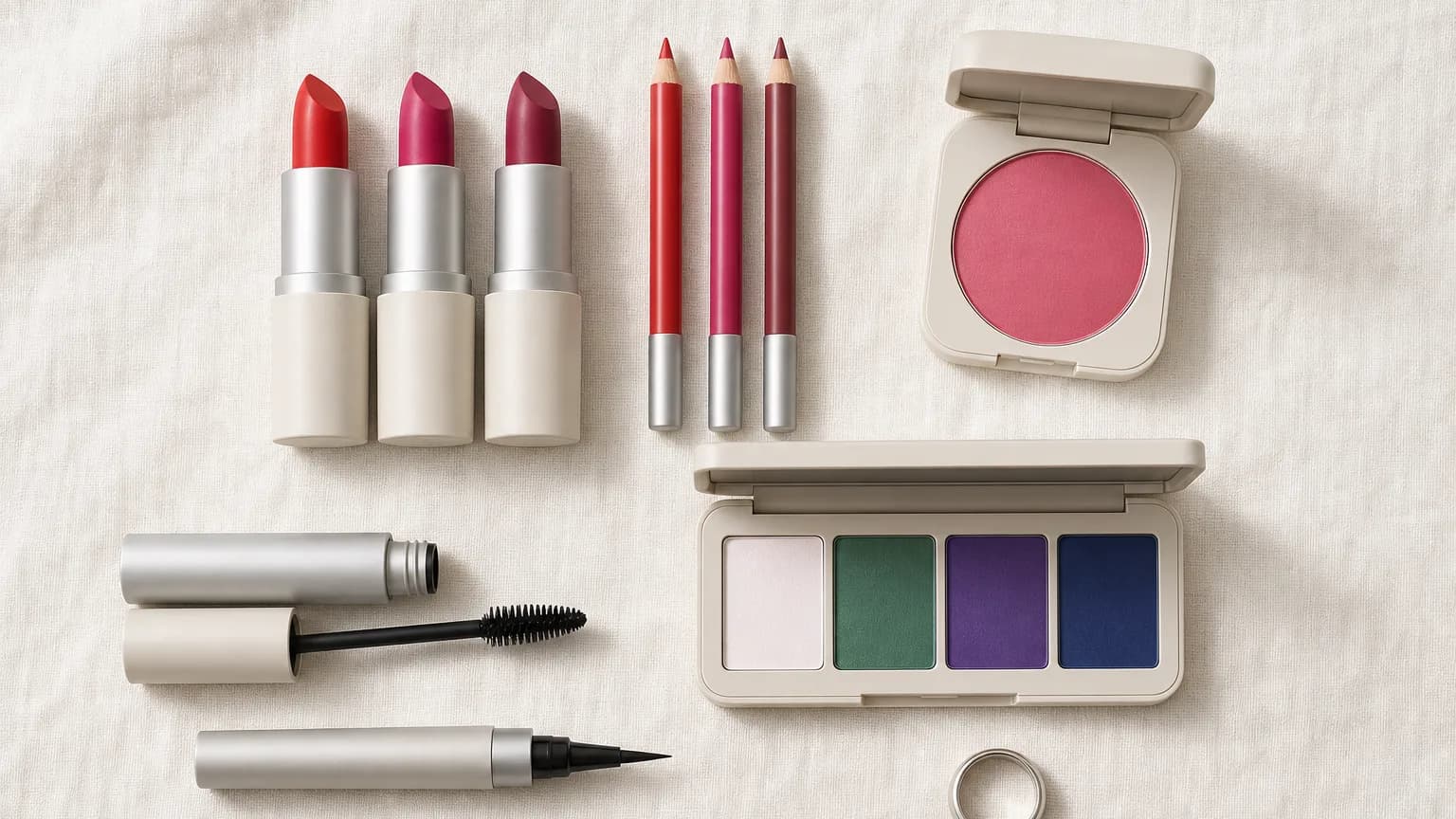
Foundation
Look for neutral-cool or neutral shades with a pink or rosy-neutral base, in a natural or satin finish. Avoid golden or yellow-based shades, which look sallow on Bright Winter skin. Letter codes differ between brands, so check what each brand means by its labels, and test in daylight on the jawline.
Blush and bronzer
Cool pink, clear rose and berry for every day; fuchsia or plum for drama. Skip heavy bronzer, or use a very light, neutral-cool contour instead of a golden one.
Lips
True red, cherry red, fuchsia, magenta and berry are the signature shades; cool clear pinks for every day. Avoid brown nudes, orange-reds and muted dusty rose, which flatten clear coloring.
Eyes
Icy white and silver to brighten, emerald, navy and deep purple to define, charcoal or slate for a classic smoky eye, and a touch of magenta for color. Avoid warm bronze, rust and golden brown.
Liner and mascara
Black is the classic choice and suits the season's contrast. Navy, charcoal and plum are softer alternatives; brown-black works for a natural look.
Want the exact products? The complete Bright Winter guide includes our foundation, blush, lipstick, eyeshadow and mascara shade picks. Get the complete guide →
Best hair colors for Bright Winter
Bright Winters look best in hair colors that keep contrast and shine: cool or neutral dark brown, black-brown, soft black and, if it is natural to you, blue-black.
Avoid colors that add warmth or softness your coloring does not have: golden or caramel highlights, copper, ashy mousy blonde and dull, flat brown.
Shine matters more than dimension. A glossy, single tone usually looks better than soft balayage, which can blur your natural contrast.
Talking to your colourist
- Bring this phrase: "I'm a Bright Winter: cool-leaning, clear and high-contrast. I want a glossy, cool-neutral color that keeps contrast with my skin, nothing golden, coppery or ashy-dull."
- Ask for cool or neutral tones (often called ash, natural or violet series in deeper shades) rather than golden or copper.
- If you go lighter, keep enough depth to preserve the contrast between your hair and skin, and avoid warm caramel ribbons.
- Ask for a clear or cool gloss every few months to keep shine and stop brassiness.
- Bring photos of the result you want in daylight, not under salon lights.
Bright Winter going grey and over 50
Going grey as a Bright Winter
- Natural grey on a Bright Winter is often a clear silver, bright white or striking salt-and-pepper, which can look spectacular because it stays cool and clean.
- If you are going grey, let the silver come through with a clear gloss rather than covering it with a flat dark dye, which shows harsh roots. Cool silver blending works if you want a gradual change.
- Once your hair is silver or white, the contrast shifts: icy white and deep navy still work, and clear jewel tones near the face (sapphire, emerald, fuchsia) become even more flattering.
Bright Winter over 50
- Your season does not usually change with age, but contrast often softens a little as hair lightens. Keep the clarity of your colors and lean toward medium brights rather than the very darkest shades.
- Black can start to look severe next to softer hair. Navy, charcoal and navy purple keep definition with a gentler edge.
- Clear color near the face (a fuchsia lip, a cobalt scarf, a rose blush) restores brightness that skin and hair lose over time.
- Satin and soft-sheen makeup and fabrics stay flattering; very matte, heavy finishes can look flat, and very high-gloss finishes can emphasize texture.
Bright Winter vs. neighboring seasons
Bright Winter compared with the other Winter seasons
| Season | Undertone | Value | Chroma | Feel |
|---|---|---|---|---|
| Bright Winter | Neutral-cool | Medium | Bright (clear) | Vivid, icy, electric |
| Cool Winter | Cool | Medium-deep | Clear | Icy, crisp, dramatic |
| Dark Winter | Neutral-cool | Deep | Clear-rich | Dark, rich, dramatic |
Bright Winter vs. Cool Winter (True Winter), color by color
| Bright Winter | Icy White | Light Pink | Royal Blue | Turquoise | Forest Green | Dark Forest | Orchid | Deep Red | Light Yellow |
|---|---|---|---|---|---|---|---|---|---|
| Cool Winter | Soft White | Lavender | Royal Blue | Aqua | Emerald | Forest | Magenta | Red | Light Yellow |
Bright Winter vs. Cool Winter (True Winter)
What they share: Both are clear, high-contrast Winter seasons that suit silver, icy white and blue-based jewel tones.
What separates them: Which quality leads. Bright Winter is defined by brightness and carries the most vivid, medium-value colors; Cool Winter is defined by coolness, fully blue-based and slightly deeper.
Drape test: Compare a vivid royal blue with a deep, inky navy. If the bright blue makes you light up and the inky navy looks heavy, you are probably Bright Winter; if the navy looks crisp and the bright blue looks loud, consider Cool Winter.
Bright Winter vs. Bright Spring (Clear Spring)
What they share: Both are bright seasons with clear coloring and high contrast; both look washed out in muted, dusty colors.
What separates them: Undertone. Bright Winter leans cool; Bright Spring leans warm.
Drape test: Hold a blue-based hot pink and a warm coral-pink under your chin in daylight. The one that makes skin look clear and even (rather than sallow or ruddy) is your side of the line.
Bright Winter celebrities
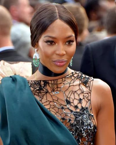
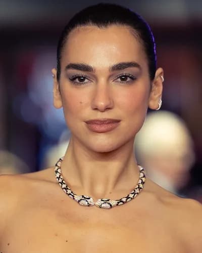
Well-known people often typed as Bright Winter, across skin tones. These are informed estimates from public photos, which vary with lighting, makeup and hair color.














The Hathaura report maker
Have a Bright Winter client? Send them a report like this.
Everything on this page, the Bright Winter palette, the colors to avoid and the scores, becomes a personal color report with your brand on it.
The Hathaura Method: a standardized 12-season analysis based on the hue, value and chroma of your client's hair, skin and eyes, developed by Sci\ART-certified color analysts. Real color analysis, not an AI selfie app.
- 1
You analyze with the Hathaura Method
Rate your client’s hair, skin and eyes on hue, value and chroma. Hathaura combines your ratings with color values measured from their photo and scores their season the same way every time. No AI guessing, and the final call is always yours.
- 2
You pick their best colors
Choose their signature color, accents and best neutrals from their season’s palette.
- 3
You send it, your way
Email your client a link to their results or download the 20+ page PDF, with your logo on the Pro plan.
- Color analysts
- Image consultants
- Personal stylists
- Hair colorists & salons
- Anyone who analyzes friends
Your first client report is free. Plans from $49/month, with 30% off your first month. Cancel anytime.
Color Studio
Your Personalized Analysis
Lena Morris
Bright Winter
Bright Winter is a vivid, cool-leaning season with very high contrast and clear coloring. It is defined first by brightness, then by coolness.

Your Signature Color
ROYAL BLUE
Your Color Palette
Style Guide
20+ Page Reports
Branded & ready to send
Try Bright Winter colors on yourself
Add a selfie and compare yourself framed in a Bright Winter color against a color to avoid. Switch colors to see which ones make your skin look even and your eyes brighter.
✓ Wear
Royal Blue
✕ Avoid
Warm Autumn Mustard
Private: your photo stays on your device and is never uploaded. Use daylight, no filters, hair pulled back.
Making the change to a Bright Winter wardrobe
- Don't throw everything out. Sort your wardrobe into three piles: in-palette, close (wearable with help), and out.
- Move out-of-palette colors away from your face. Camel trousers or a khaki skirt can stay; a beige or dusty top can be worn under a navy or icy white layer, or with a scarf in your colors.
- Replace the pieces you wear most first: coat, everyday knitwear and your most-worn tops.
- Shop with your palette on your phone. Compare the item to your swatches in daylight before buying.
- Change makeup and glasses frames early: they sit closest to your face and make the biggest difference for the least money. A clear red or fuchsia lip is often the fastest win.
- Give it four to six weeks. Most people notice they get more compliments and spend less time deciding what to wear.
Self-test: are you a Bright Winter?
Six or seven "yes" answers: Bright Winter is very likely. Four or five: you are probably a Bright or Winter season; check the Cool Winter and Bright Spring comparisons below. Three or fewer: look at the other seasons in the Hathaura Color Standard, or book a professional analysis.
Bright Winter FAQ
What colors look best on a Bright Winter?
Clear, saturated, cool-leaning colors: royal and cobalt blue, emerald, jade, turquoise, hot pink, fuchsia, true red, royal purple, plus icy white, icy lights and deep navy. Every color is clean, with no grey or brown mixed in.
Can Bright Winters wear black?
Yes. Black suits Bright Winter's high contrast better than it suits most seasons. On its own it can look severe, so add a clear bright near the face, such as a cobalt scarf, an emerald top or a red lip. Deep navy is an equally strong alternative.
Can Bright Winters wear white?
Yes. Pure white and icy white both look crisp and fresh. Cream, ivory and off-white are the ones to skip, because they can look dingy or yellow next to clear coloring.
Is Bright Winter warm or cool?
Neutral-cool. It is the least cool of the Winter seasons, which is why it sits next to Bright Spring and why a few Bright Winters can carry a clear yellow or a bright, polished gold accent.
What is the difference between Bright Winter and Bright Spring?
Both are bright and high-contrast. Bright Winter leans cool (blue-based pinks, cobalt, icy white, silver); Bright Spring leans warm (coral, warm hot pink, cream, gold). Test a blue-pink and a coral-pink side by side in daylight.
Can Bright Winters wear gold or silver jewelry?
Silver, white gold and platinum are the best match. Bright, polished yellow gold can work in small pieces; brushed, antique and coppery metals tend to look dull.
What hair color suits a Bright Winter?
Glossy, cool-neutral shades that keep contrast with your skin: cool dark brown, black-brown, soft black, or blue-black if it is natural to you. Avoid golden or caramel highlights, copper and dull, ashy shades.
Is a selfie color analysis app accurate for Bright Winter?
It can be a useful first read, but lighting matters a lot: warm bulbs push Bright Winter toward Bright Spring, and dim light dulls clear coloring. In our data, when people retook a selfie analysis, the season changed 62% of the time. Use daylight, no filters, and confirm with drape tests or a professional.
Can your season change from Bright Winter as you age?
Your underlying season usually stays the same. Contrast often softens a little as hair turns silver, but the clarity remains, so most Bright Winters keep their clear colors and lean toward medium brights and navy rather than black.
Save your Bright Winter palette
Download the Bright Winter palette for your phone
All 27 core colors with names and hex codes, sized for your phone's photos so you can shop with it.
The complete guide
Bright Winter Style Guide
All 47 colors, every pairing, makeup product picks, prints, metals and stones, and wardrobe basics, in a printable PDF you keep. 800+ guides sold, rated 4.8★ on Etsy.
Download FULL Guide on EtsyNot sure you're a Bright Winter? Try ColorSnap AI (our free photo tool) in daylight, then confirm with the drape tests above, or read our guide to the best color analysis apps.